Adaptive Color Tokens Enter Mainstream Design Systems for Low‑Vision Support
Design · 5 min read
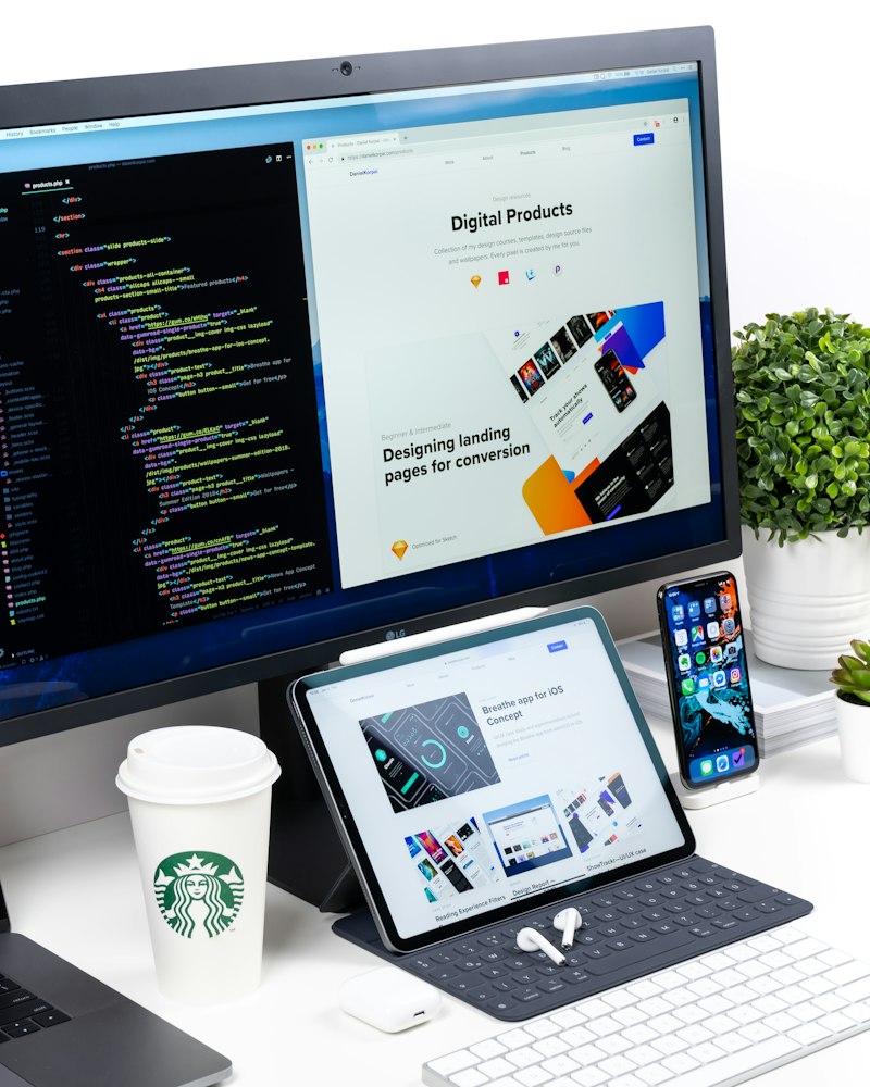
Design teams are increasingly standardizing adaptive color tokens — semantic variables that can shift values based on user preferences, ambient conditions, or accessibility modes. Instead of hard-coding light and dark palettes, systems now expose tokens like "primary-foreground-contrast" that resolve differently when a high-contrast or low-vision profile is active. This reduces one-off overrides and keeps visual language consistent across platforms.\n\nEngineers are tying these tokens to runtime signals: OS-level high-contrast flags, browser media queries, and user-reported vision settings inside account preferences. The tokens are also being paired with perceptual color math (contrast-aware blending and color-vision simulators) to avoid color shifts that reduce legibility for specific conditions such as macular degeneration or color-deficiency overlaps. Product teams say this reduces regression risk when components are reused.\n\nThe move also impacts design tooling: Figma and code-based token managers are being extended to preview tokens against simulated accessibility profiles, and build pipelines now include automated contrast checks for resolved token values. The result is a tighter feedback loop between designers and developers—one that prioritizes legibility from the earliest mockups through production releases.