Before and after: reworking TaskNest’s dashboard to cut cognitive load
Design · 4 min read
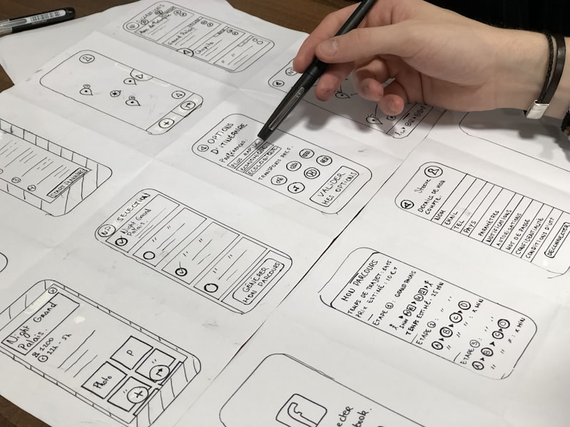
TaskNest, a startup for distributed teams, had a dense dashboard that tried to show everything: project lists, activity streams, deadlines, and suggestions all on one screen. Usability testing and heatmap analysis showed users scanned the left column then bounced, missing critical tasks and late items. Designers hypothesized the dashboard violated information scent and required users to decide what to focus on without adequate affordances.
The redesign introduced a prioritized “Today & Focus” column that surfaces three highest-impact tasks per project based on deadlines and mentor signals, while relegating less urgent activity to collapsible sections. Cards were simplified with a single headline, time-to-complete estimate, and a clear CTA. Colors shifted from saturated badges to a muted palette with color used only for status and urgency to reduce noise.
Quantitative results backed the change: time-to-first-action decreased by 26% and weekly active users rose 12% in the first month. Qualitative feedback praised the new focus column for helping users start work without scanning multiple views. Accessibility improvements—larger hit targets and explicit keyboard focus order—also reduced friction for power users who rely on keyboard navigation.
For startups, the takeaway is to reduce choices at first glance and use progressive exposure for detail. Heatmaps, task-level telemetry, and short moderated sessions informed decisions faster than lengthy spec wars, enabling TaskNest to ship a high-impact dashboard with measurable ROI.