Before/After: EchoBand Strips Discovery Tabs to Focus on Creator Sessions
Design · 5 min read
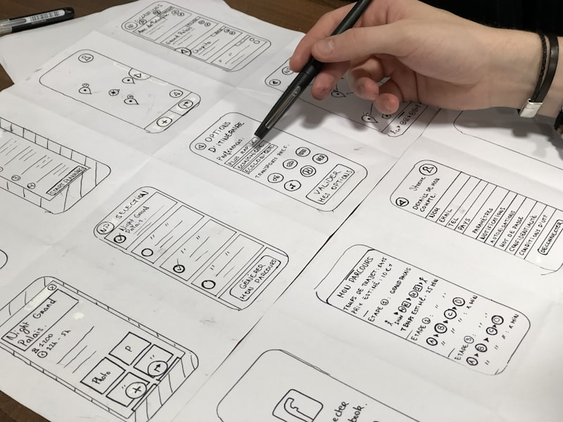
EchoBand’s analytics team found creators were spending less time producing content and more time managing where to post and how to discover listeners. The product team hypothesized that overly broad discovery features were fragmenting attention. Designers proposed removing two low-engagement discovery tabs and folding essential discovery into contextual, creator-facing tools like audience insights and easy-sharing UIs.
The before/after design reduced visible navigation choices and added a persistent “go live” affordance atop the main feed for creators. The team also implemented micro-feedback for creators: listener counts, follow rates, and short-form reaction metrics shown in real time. Discovery for listeners was moved into a single curated feed and a search bar to avoid overexposing ephemeral tabs.
After the rollout, creator sessions (time spent producing audio or going live) increased by 19% and the number of active creators rose by 14% month-over-month, while listener engagement stayed flat—alleviating concerns that discovery suppression would hurt passive users. EchoBand framed the change as audience prioritization: optimizing the product for creators first to grow long-term content supply.