Before/After: Finova's Mobile Dashboard Redesign Turns Passive Users into Active Investors
Design · 5 min read
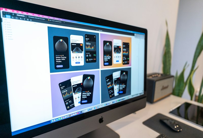
Finova's original dashboard presented a large net-worth figure, a dense performance chart, and a carousel of promotional cards. Many users checked the app monthly and took no action. The product team reframed the dashboard as a starting point for small behaviors: 'Check a goal,' 'Top up $10,' 'Rebalance by one click.' Design research identified that users wanted clarity on what to do next, not another snapshot of metrics.
The redesign introduced a prioritized action rail: micro-goals surfaced based on user history (e.g., 'Add $5 to Emergency Fund—1 click'), simplified sparkline charts with explainer hover states, and a single consolidated CTA that opened a frictionless micro-invest flow. Visual hierarchy emphasized outcomes and progress rather than raw numbers, and onboarding tours nudged inactive users toward their first micro-action.
Within two months Finova recorded a 22% lift in weekly active users and a 19% increase in users completing at least one micro-investment. Revenue per active user ticked up as micro-actions converted into fuller product usage. Finova's dashboard pivot shows how reframing information as small, actionable steps can convert passive observers into engaged customers.