Before/After Redesign: Indie Mobile RPG Improves First-Time UX with Guided Flow
Gaming · 5 min read
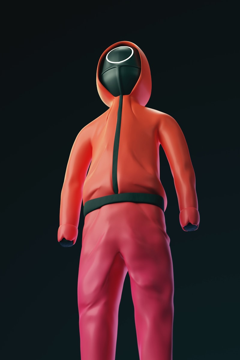
Originally, the RPG launched players into a fully open starter zone with minimal direction, reflecting the studio’s belief in emergent play. However, analytics showed steep churn in the first 20 minutes as players missed core mechanics and felt overwhelmed. Playtests confirmed that discovery alone wasn't enough to teach essential systems.
The after redesign introduced a short guided prologue that taught combat, inventory management, and progression in context. The UI was temporarily retooled to reveal key elements one at a time, and checkpoints rewarded players for mastering small tasks. Designers preserved the core open-world experience after the prologue to maintain the game's spirit while ensuring players had the skills to enjoy it.
Impact metrics were clear: tutorial completion rates rose from 46% to 82%, and day-7 retention increased by 14%. Players reported higher satisfaction with early progression and fewer reports of confusion in community channels. Some power users initially decried reduced freedom, but the studio added a 'skip tutorial' option for returning players and a 'challenge sandbox' for those who prefer discovery.
The case highlights a common tension in game UX: balancing player agency with the need to surface mechanics that enable long-term engagement. Thoughtful, time-boxed guidance can preserve emergent play while reducing avoidable churn among new players.