Before/After: Simplifying a Complex SaaS Dashboard for Non-Technical Users
Design · 4 min read
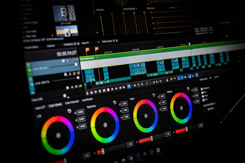
The original dashboard overloaded users with metrics, toggles, and configurable widgets, assuming a power-user mindset. Usability testing revealed that non-technical roles couldn't find critical actions and often defaulted to support calls rather than using in-app features.
The team introduced role-based default layouts, surface-level goal cards, and contextual next-steps instead of raw metrics. Designers created 'starter views' for three common personas and a lightweight tour that taught one primary workflow rather than everything at once.
Post-launch analytics showed a 35% increase in first-week task completion for non-technical users and a 28% drop in onboarding-related support tickets. Qualitative feedback highlighted that users felt the product 'knew what I needed' rather than asking them to adapt.