Case study: DineEasy’s three-week checkout redesign increases conversion by 18%
Design · 4 min read
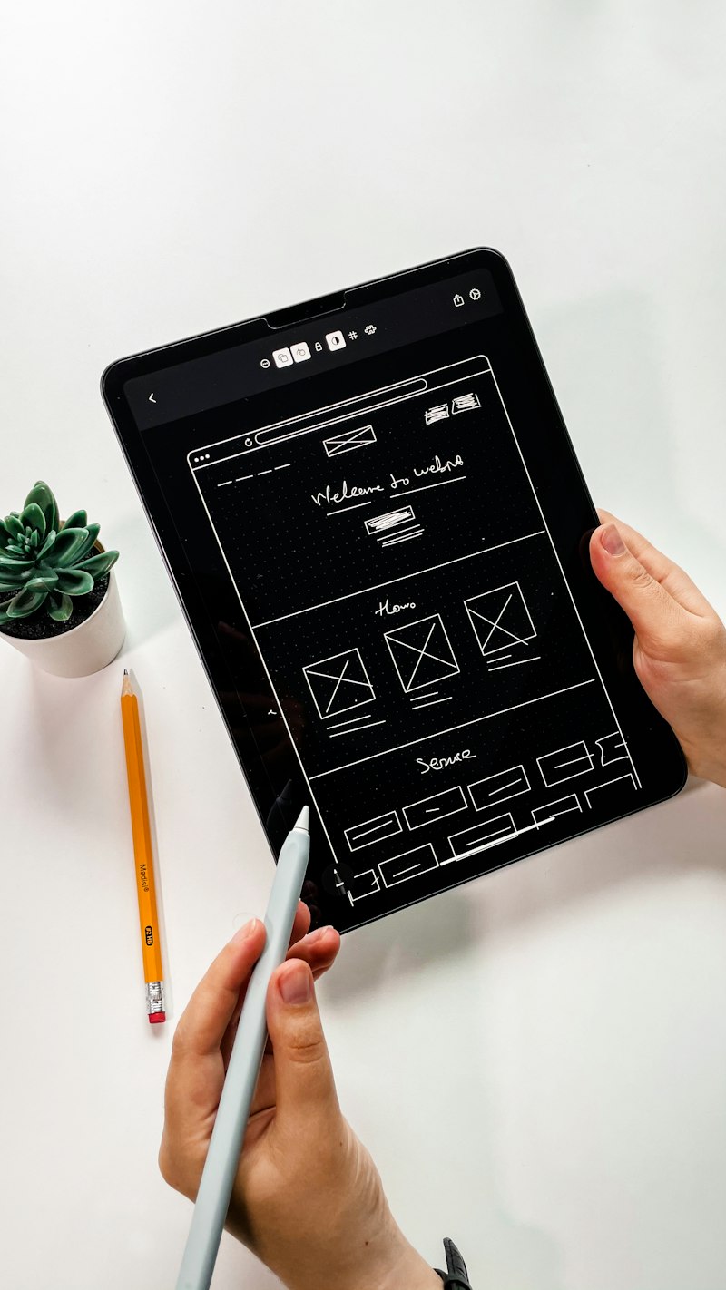
DineEasy noticed rising cart abandonment between the review and payment screens, especially among first-time customers on Android devices. Through session replay and funnel analysis, the product team identified three friction points: confusing fee breakdowns, an overloaded address form, and a payment input that rejected cards without clear guidance.
The team ran a focused three-week redesign sprint. Week 1 involved guerrilla usability testing and mapping an ideal checkout flow. Week 2 created low-fi prototypes and tested alternative fee presentations and an inline smart-address autocomplete. Week 3 moved to hi-fi Figma mockups and a lightweight react native implementation that used progressive disclosure for optional inputs and inline validation with suggested fixes.
A 30-day A/B test showed an 18% increase in completed checkouts, a 24% decrease in address corrections, and a 12% drop in contact-to-support messages. The designers attribute the wins to clearer cost transparency, reduced cognitive load in the form, and actionable inline error messages. DineEasy rolled the changes to all users and added a quarterly review cadence to keep checkout performance aligned with menu and pricing experiments.