Case Study: Simplifying Investor Dashboards for Seed-stage Startup Prosperly
Design · 5 min read
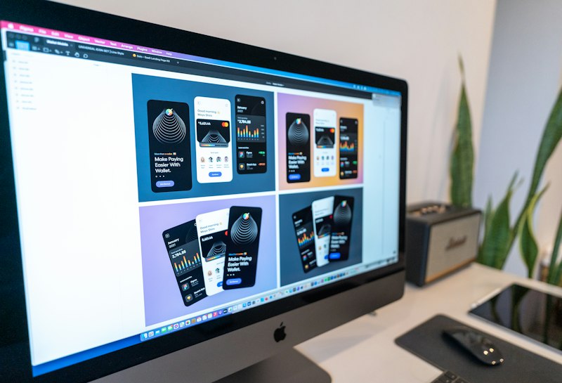
Prosperly's dashboard had grown organically over 18 months, accumulating dozens of widgets and several inconsistent date pickers. Investor feedback indicated difficulty finding runway, burn rate, and cohort performance quickly. The product team ran card-sorting with 40 investors and internal staff to surface mental models and an information hierarchy that matched real decision-making needs.
Designers collapsed low-value widgets into an insights layer and created a top-level snapshot that displayed the three most actionable metrics by default, with a customizable 'pinboard' for power users. They introduced data scaffolding patterns: contextual tooltips, linked drill-downs, and a timeline scrubber to reveal historical values without leaving the page. Accessibility and responsive behavior were addressed early so the dashboard stayed useful on tablets during investor meetings.
After shipping, average time-to-decision for sample investor tasks dropped from 2.4 minutes to 58 seconds, and NPS among investor users jumped by 12 points. The team attributed success to a disciplined content audit, user-led hierarchy design, and a modular UI that allowed new metrics to be added without breaking discoverability.