Figma's Mobile Companion: A Design-Focused Product Teardown
Design · 5 min read
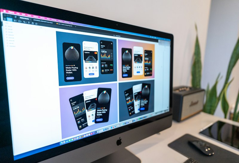
Figma's web-first experience doesn't translate directly to mobile; the companion apps needed a focused surface area. The mobile product centers on viewing, comment-driven collaboration, and lightweight prototyping review rather than full editing. This prioritization reflects a pragmatic understanding of mobile context: short sessions, thumbs-up interactions, and on-the-go feedback rather than heavy layout work.
Gesture design and navigation are optimized for inspection and commenting. Pinch-to-zoom, tap-to-select, and persistent comment pins map naturally to how stakeholders review designs on mobile. Figma also emphasizes synchrony: cursors and presence indicators show who is looking at what, which reduces duplicative feedback and makes remote design reviews feel anchored.
The teardown recommends product teams build mobile companions that embrace mobile’s strengths: frictionless review, context-aware notifications, and simple action surfaces for approval or quick edits. Attempting parity with desktop editing typically results in brittle UX and low engagement.