From Feature Bloat to Focus: How NomadFinance Cut 40% of Screens to Improve Activation
Design · 6 min read
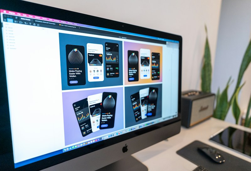
NomadFinance, a personal finance app for remote workers, had been growing features rapidly in response to customer requests, but activation metrics stagnated. A cross-functional audit cataloged every screen and flow, annotated usage frequency, and labeled perceived business value. The audit revealed many low-usage configuration screens and duplicate ways to perform the same task.
Design leadership proposed a radical plan: remove or hide 40% of screens and consolidate flows with modular components that could be unhidden later if needed. Convincing stakeholders required data — heatmaps, time-on-task, and impact modeling showing the expected reduction in cognitive load and faster time-to-first-success. The team negotiated a roadmap that preserved high-impact enterprise features while cutting low-signal consumer options.
Post-redesign metrics were immediate: a 30% reduction in average onboarding time, a 26% increase in task completion within the first session, and fewer support tickets for navigation-related questions. Equally important was the roadmap clarity the cut afforded: product could now invest in smoothing the core flow rather than constantly managing edge-case screens. The case emphasizes governance techniques for startups to avoid feature creep: quarterly screen audits, usage thresholds for retention, and a rapid rollback plan for any removed feature.