How a Seed Marketplace Cut Checkout Drop-off by 32%: A Mobile-First Redesign
Design · 5 min read
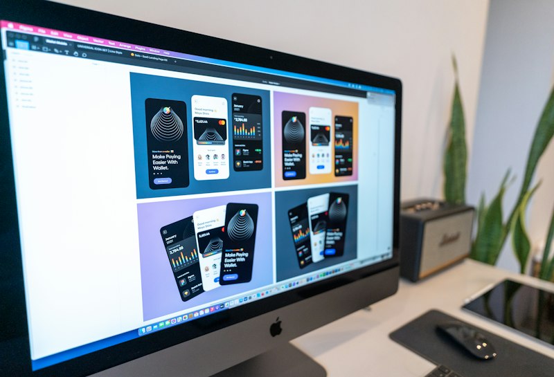
The marketplace launched with a desktop-first checkout that required seven separate screens and a heavy credit-card form that users found intimidating on small devices. After qualitative interviews and heatmap analysis, the product team prioritized mobile ergonomics and reduced information density on each step. The goal was not to add features but to make the path to purchase feel inevitable.
Design changes included a condensed address and payment collection using single-field inputs, visible progress indicators, and merchant previews that reinforced value before payment. They also implemented conditional fields so only necessary inputs appeared, and replaced small CTAs with large thumb-friendly buttons. A subtle, persistent summary stayed at the bottom of the screen so users could review costs without leaving the flow.
Within six weeks of release, analytics showed a 32% reduction in checkout abandonment and a 14% increase in average order value attributable to clearer upsells. The team documented their decision-making in a lightweight playbook that prioritized speed of iteration and metrics-aligned hypotheses — a practical pattern other seed teams can replicate.