How BloomCart's 3-week checkout redesign lifted conversions by 18%
Design · 5 min read
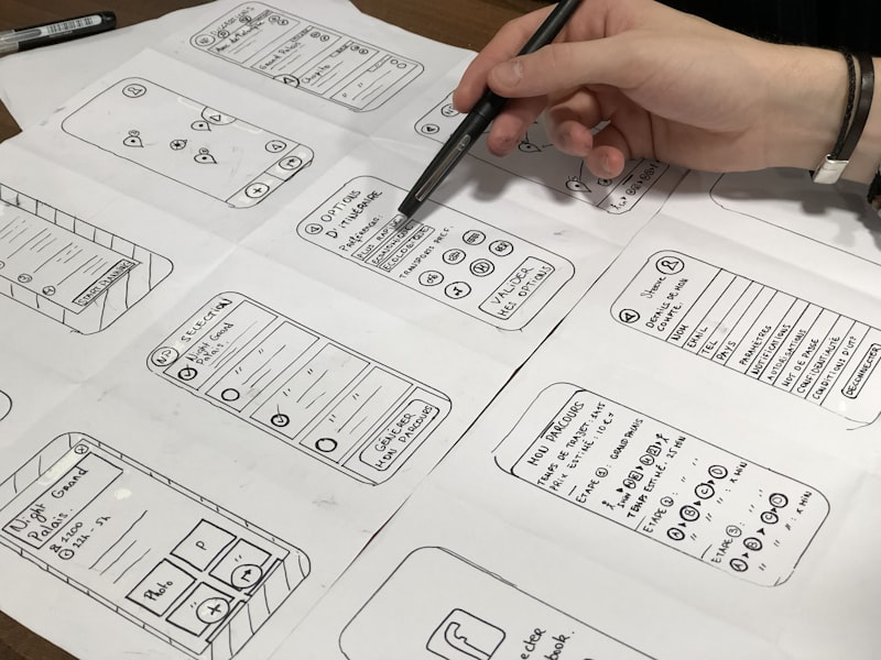
When BloomCart's analytics team flagged a 32% drop-off between cart and order confirmation, the product team initiated a three-week redesign sprint focused solely on checkout. Researchers ran five moderated sessions and 120 remote unmoderated tests to map mental models and identify friction points: unclear delivery windows, buried promo code fields, and an overfull UI that made the primary CTA hard to find.
Designers applied progressive disclosure, moved the promo code into an expandable row, introduced payment method shortcuts, and raised visual priority on the primary CTA using a single-color emphasis and strengthened affordance. The redesign reduced visible form fields by 42% and introduced inline validation with friendly microcopy to reduce error rates.
A two-week A/B test with live traffic showed an 18% relative increase in conversion (p < 0.05) and a 9% reduction in payment errors. The team shipped the changes and prioritized a follow-up roadmap item to test delivery window presets. The key takeaway: targeted reductions in cognitive load and clearer affordances beat adding new features when conversion is the metric to move.