How NeatCart's checkout pivot doubled completion in 90 days
Design · 6 min read
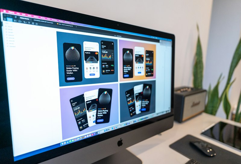
When NeatCart launched its checkout flow in late 2025, the team followed a conventional multi-page pattern with address, shipping, payment, and review screens. Qualitative research revealed two consistent pain points: users lost context during page transitions, and payment method selection required too many taps. Funnel analytics showed 49 percent completion and a sharp drop on the payment page.
The product team ran a discovery sprint that combined session replays, 12 moderated usability tests, and a small remote diary study. Designers prototyped three alternatives in Figma: a single-column inline checkout, a stepper with persistent cart summary, and a compact overlay checkout. The single-column inline checkout won in quick unmoderated tests thanks to easier keyboard navigation and fewer perceived steps.
Implementation focused on micro-interactions and accessibility: keyboard-first flows, explicit progress state, prioritized payment methods inferred from user history, and server-side validation to avoid page reloads. Engineers introduced a progressive enhancement layer so the flow degrades gracefully for low-end devices. After a 6-week A/B test, conversion rose from 49 percent to 74 percent and average time-to-complete dropped 22 percent.
NeatCart's key lessons were pragmatic: reduce perceived steps, keep users in context, and invest engineering time in validation and performance rather than visual polish alone. The team also documented design tokens and accessibility states to ensure the improvements scale across merchants and locales.