Inclusive Naming and State Design: Practical Guide for Component Libraries
Design · 4 min read
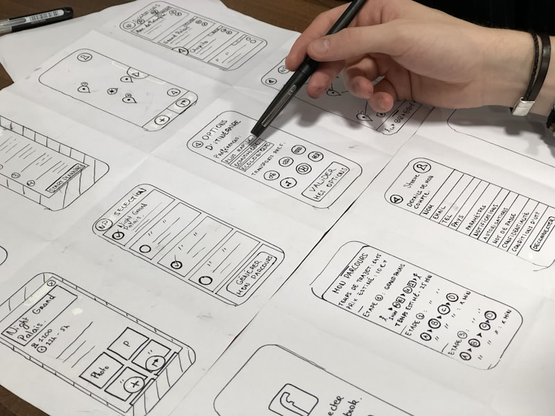
Component naming often carries implicit assumptions. Labels like "default" or "primary" may work for developers but fail to describe behavior for assistive tech authors. Inclusive naming means describing intent and behavior rather than appearance: for example, using "confirm-action" instead of "danger" for a control that completes a critical operation. This reduces ambiguity when teams map components to accessibility roles or when content teams translate UI labels.
State design is another area where clarity boosts accessibility. Explicit state tokens for "hover", "focus-visible", "pressed", "disabled", and "error" should be documented and built into the library so that implementers don’t have to infer behavior. Proper focus management patterns are critical for keyboard users and screen readers; component docs should show DOM order, tabindex expectations, and recommended ARIA attributes alongside visual states.
Libraries that adopt these practices also update their contribution guidelines and review checklists to include inclusive naming and state considerations. Automated linting can enforce state tokens and flag ambiguous names in pull requests. The result is easier collaboration across design, engineering, and content teams, and fewer surprises for users with assistive needs.