Major component libraries publish accessibility-first blueprints for responsive, motion-safe UI
Design · 4 min read
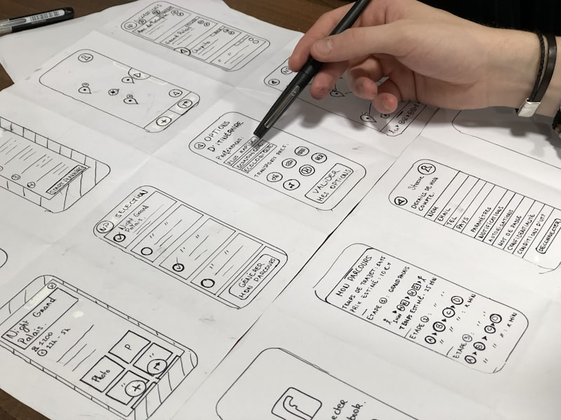
Three leading component library teams released coordinated blueprints that codify accessibility considerations for common UI primitives: navigation, forms, lists, and modals. Rather than issuing isolated component updates, the blueprints define cross-cutting rules — for example, how focus management should behave across nested modals or how motion reduction preferences propagate through animations and microinteractions.
The blueprints also define responsive semantics: rules for when a collapsed nav should expose different ARIA roles, how form groups should annotate progressive disclosure content, and adaptive typography scales that respect user text-size preferences. Motion-safety is another core section, with guidance on substituting animated affordances with static cues and programmatically honoring OS-level reduced-motion settings.
Design system teams view the blueprints as a way to cut down on divergent implementations that introduce accessibility regressions. Organizations that maintain multiple design libraries or platform-specific forks can use the blueprints as a canonical reference to keep behavior consistent across web, native, and embedded webviews.
The coordinated release is also practical: each blueprint comes with test cases, a Storybook kit, and a pull-request template that enforces accessibility checks. For teams that struggle to operationalize accessibility, these blueprints provide a pragmatic bridge between design intent and engineering verification.