Why early prototyping saved LoopHealth from a costly UI rewrite
Design · 5 min read
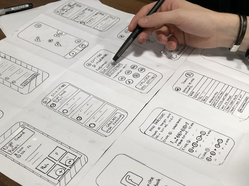
LoopHealth, a startup building clinician‑facing teletriage tools, originally designed a tabbed UI intended to mirror consumer apps. Early prototype sessions with clinicians showed a mismatch: providers expected contextually persistent patient info while tabs discarded crucial context during navigation. The design team paused development and ran a rapid 10‑day low‑fidelity prototype process with real clinicians in three hospitals.
The prototypes surfaced two key constraints: clinicians needed a persistent patient panel and quick access to recent notes, and they preferred vertical task flows over independent tabs. Armed with these insights, the team pivoted to a split‑pane layout with a persistent patient header and an activity rail. This shifted the mental model from discrete app modes to continuous patient‑centric workflows.
Because engineering had not yet implemented the original tabs at scale, the change avoided weeks of rework and preserved sprint velocity. Post‑launch usability scores among clinical users increased by 42%, and average task completion time for triage cases dropped 25%. LoopHealth's experience reinforces investing in early prototype validation for domain‑specific products where assumptions about mental models can be costly.