Why Tesser Chose Accessibility-First Design Over Trendy Dark Mode
Design · 3 min read
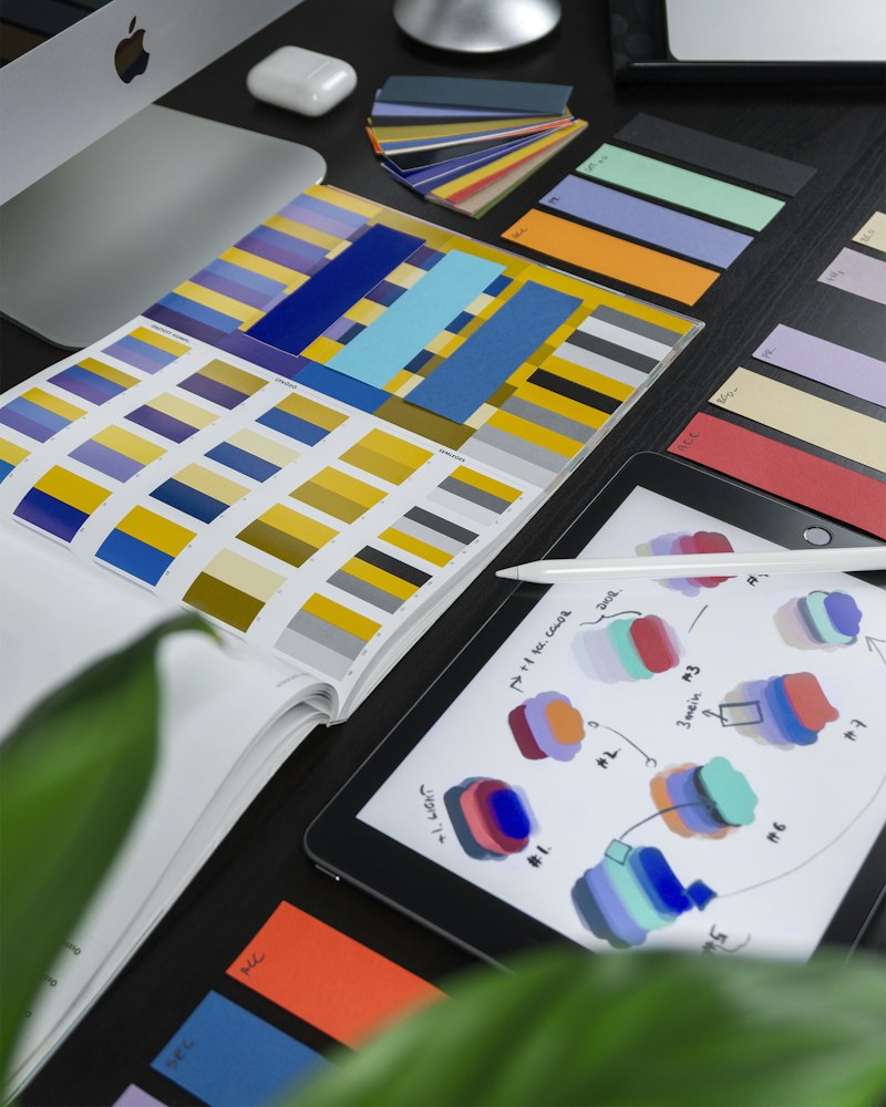
When dark mode became an almost default checkbox for new apps, Tesser’s product team paused and ran an accessibility-first experiment. Instead of shipping a separate dark theme, they implemented adaptive theming that prioritized contrast ratios, legible type scales, and support for system-level accessibility settings. The goal was to serve users with variable lighting, photosensitivity, and low vision without fragmenting the design language.
Designers focused on dynamic contrast tokens, responsive type that respected user scale preferences, and a set of color-safe palettes that worked across light, dim, and high-contrast contexts. They also built an accessibility toggle that applied semantic adjustments—larger tap targets, simplified motion, and increased spacing—rather than just inverting colors.
The approach paid off: accessibility metrics (screen-reader-friendly flows, reduced long-press errors, and fewer complaints about readability) improved, and engineering costs for maintaining multiple theme branches were reduced. Tesser’s decision is a reminder that inclusive defaults can outperform stylistic chasing, especially for startups that must prioritize impact and developer velocity.